This post explains how to use our legacy plotting tools. When QTLmax 1.0 was first launched, it prioritized powerful computational features, offering only essential plotting capabilities. Those original tools are what we now refer to as ‘legacy plotting tools.
Since QTLmax 2.0, visualizations are handled professionally by QTLmax Workbench, an application included in the QTLmax 6.0 package. While the Workbench offers sophisticated tools for creating publication-quality plots, the legacy features remain a viable and efficient option for a quick overview of your analytical output. The legacy plotting tools are easy to use with an intuitive GUI, as they require minimal options for plotting customization. A list of tools are as follows:
- Dendrogram
- Admixture barchart
- PCA plot
- Manhattan plot
- QQ plot
Let us explore each tool one by one.
Figure 1 shows the legacy tool for dendrogram construction. As presented, the tool is fed with an output of “Genetic similarity matrix” computation. (See details on Genetic similarity matrix at https://open.qtlmax.com/guide/index.php/2025/07/03/genetic-similarity-matrix-computation/) In this matrix, the genetic similarity coefficient for an individual with itself is 1.0, based on the principle that identical twins are 100% genetically the same. Following the principle, genetic distances between individuals are measured in a pairwise manner.
This dendrogram tool supports three layouts: (1) Tree, (2) Circular, and (3) Unrooted. The available clustering methods, selectable from the combo box labeled “Agglomeration method”, include: (1) UPGMA, (2) UPGMC, (3) Complete linkage, (4) WPGMA, (5) WPGMC, (6) Single linkage, (7) Ward.D, and (8) Ward.D2.
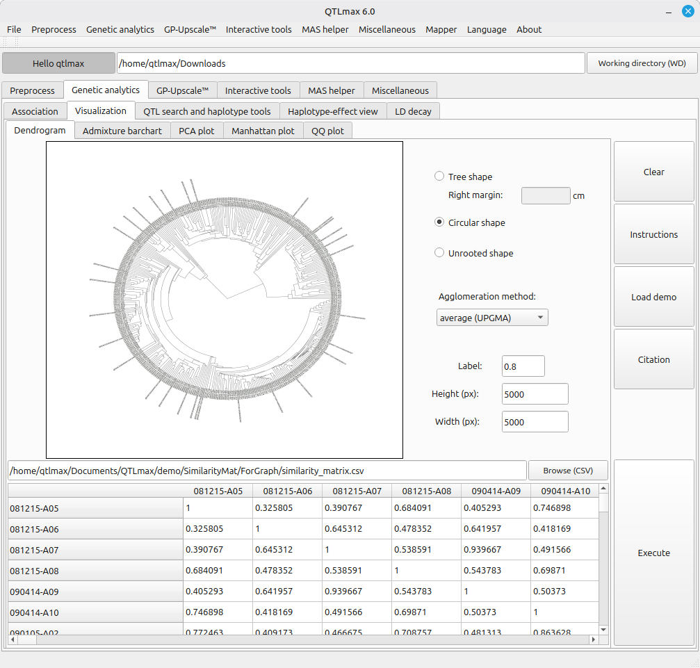
(Figure 1)
Figure 2 shows the legacy tool for drawing an admixture barchart. This tool is fed with an output of “Admixture” computation. (See details on Admixture at https://open.qtlmax.com/guide/index.php/2025/07/10/calculating-admixture-and-plotting-admixture-bar-chart/) Once the input dataset is loaded, the combo box labeled “Group” is automatically filled with numbers from 1 to K; you can choose a desired color for each group from a pop-up palette that appears upon pressing the [Palette] button. If you want to skip the manual color selection, simply fill the check box labeled “Automatic fill” with a click; then each group will be automatically and randomly tied to a color.
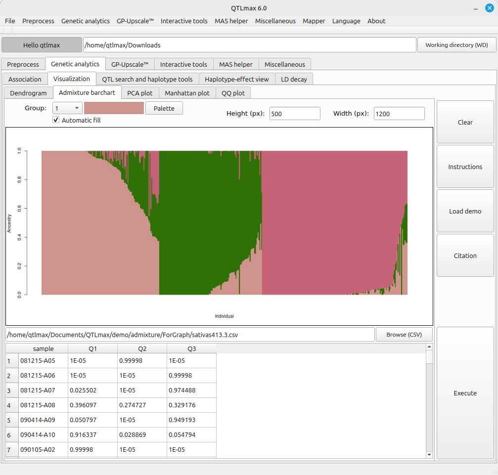
(Figure 2)
Figure 3 shows the legacy tool for drawing a PCA plot. This tool is fed with the output of a ‘PCA’ computation. (See details on PCA at https://open.qtlmax.com/guide/index.php/2025/07/03/pca/) It is important to note that prior to using this tool, you must add an additional column containing group labels for all individuals, placed immediately after the last column of the PCA output table.
Each group color can be customized in the same manner as the tool in Figure 2. By leveraging the [X axis] and [Y axis] buttons, you can plot different principal components in 2D space to visualize various PC combinations.
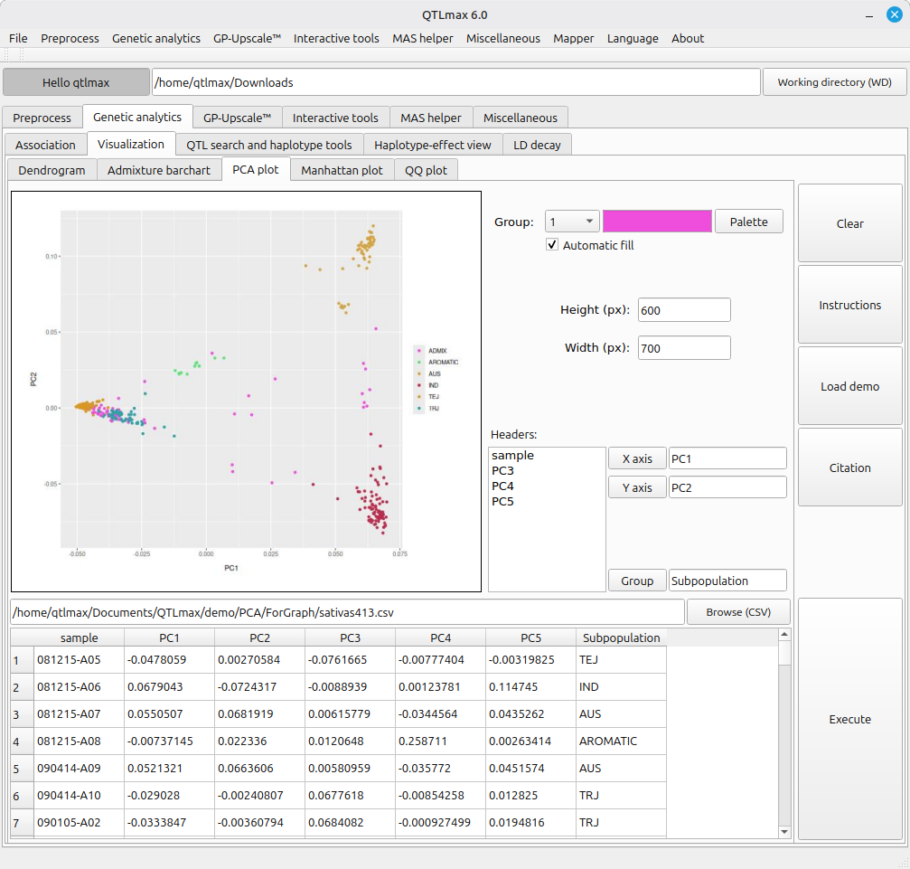
(Figure 3)
Figure 4 shows the legacy tool for drawing a Manhattan plot. This tool is fed with the output of the following computations.
- GWAS based on the Linear Mixed Model (https://open.qtlmax.com/guide/index.php/2025/07/10/lmm-gwas-procedure/)
- GWAS based on the Generalized Linear Model (https://open.qtlmax.com/guide/index.php/2025/07/11/gwas-procedure-generalized-linear-model/)
- Genomic control (https://open.qtlmax.com/guide/index.php/2025/07/10/performing-a-genomic-control-computation/)
In this plot, if you want to omit a P-value threshold line, simply leave the “P cutoff” field blank.
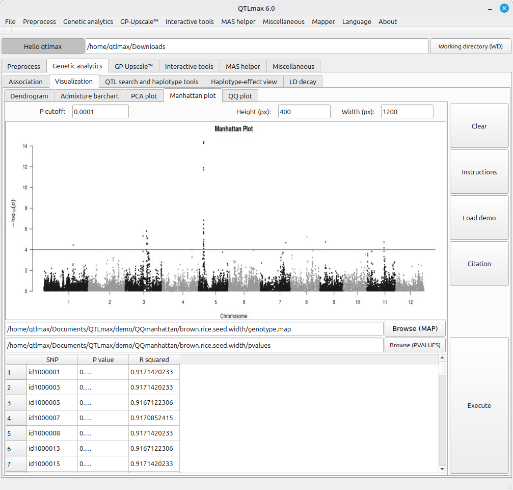
(Figure 4)
Figure 5 shows the legacy tool for drawing a QQ plot. This tool is fed with the output of the same analyses used for Figure 4.
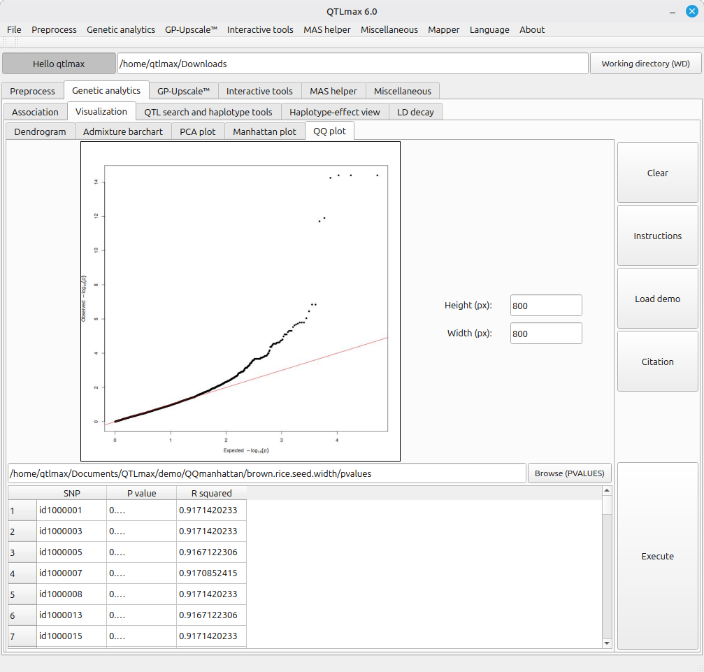
(Figure 5)