Figure 1 shows the “QTL search and haplotype tools” tab page selected within QTLmax. Press the [Browse (PVALUES)] button to open the file explorer. Navigate to the project folder containing the GWAS result file. When you select the pvalues file in that folder, all input files will be automatically loaded (Figure 1).
Enter the project name and the P cutoff value that defines the QTL, then click the [Search] button. A list of QTL markers satisfying the P cutoff condition will be displayed (Figure 1).
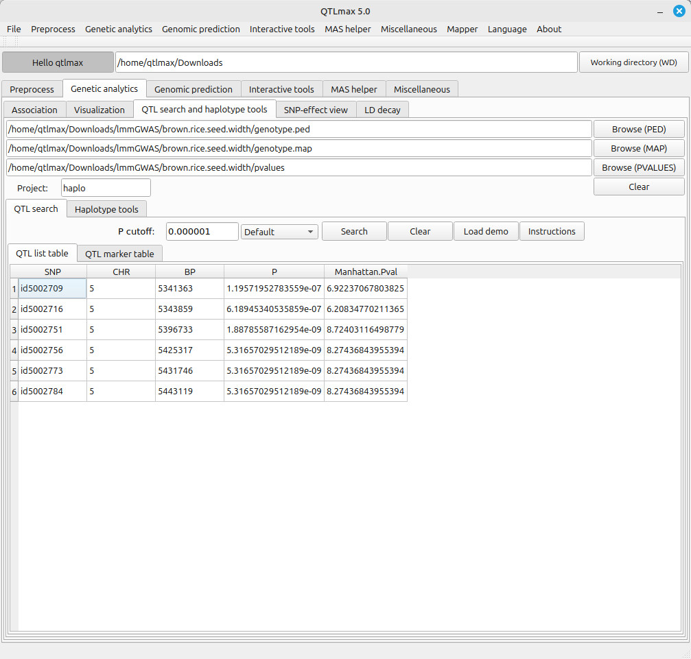
(Figure 1)
Select the “QTL marker table” tab to view a table showing information about the markers included in the QTL list. (Figure 2)
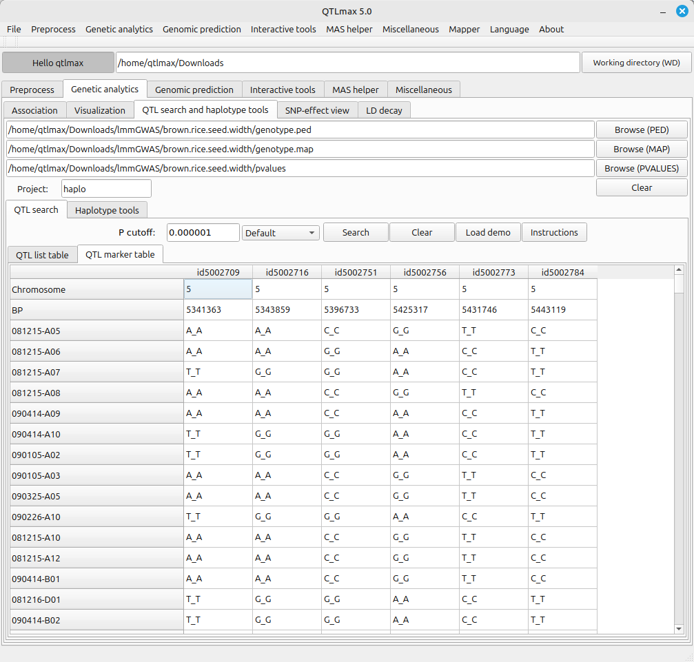
(Figure 2)
If you go to the project folder, you can see the CSV files for the tables presented in Figures 1 and 2. (Figure 3)
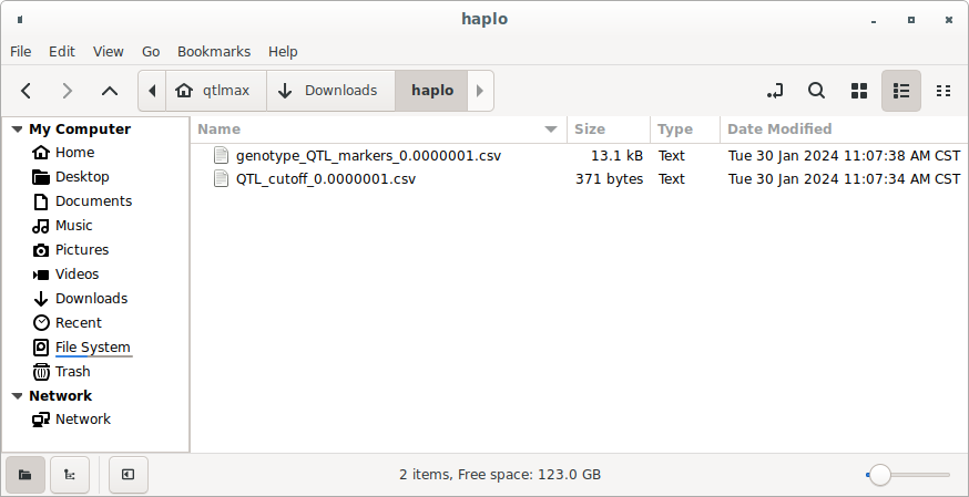
(Figure 3)
(a) The table output in Figure 1 can be found in a file with the following format:
QTL_cutoff_[P cutoff].csv
(b) The table output in Figure 2 can be found in a file with the following format:
genotype_QTL_markers_[P cutoff].csv
It is important to note that (b) will be used to draw the Violin plot along with the phenotypic data. (Figure 4)
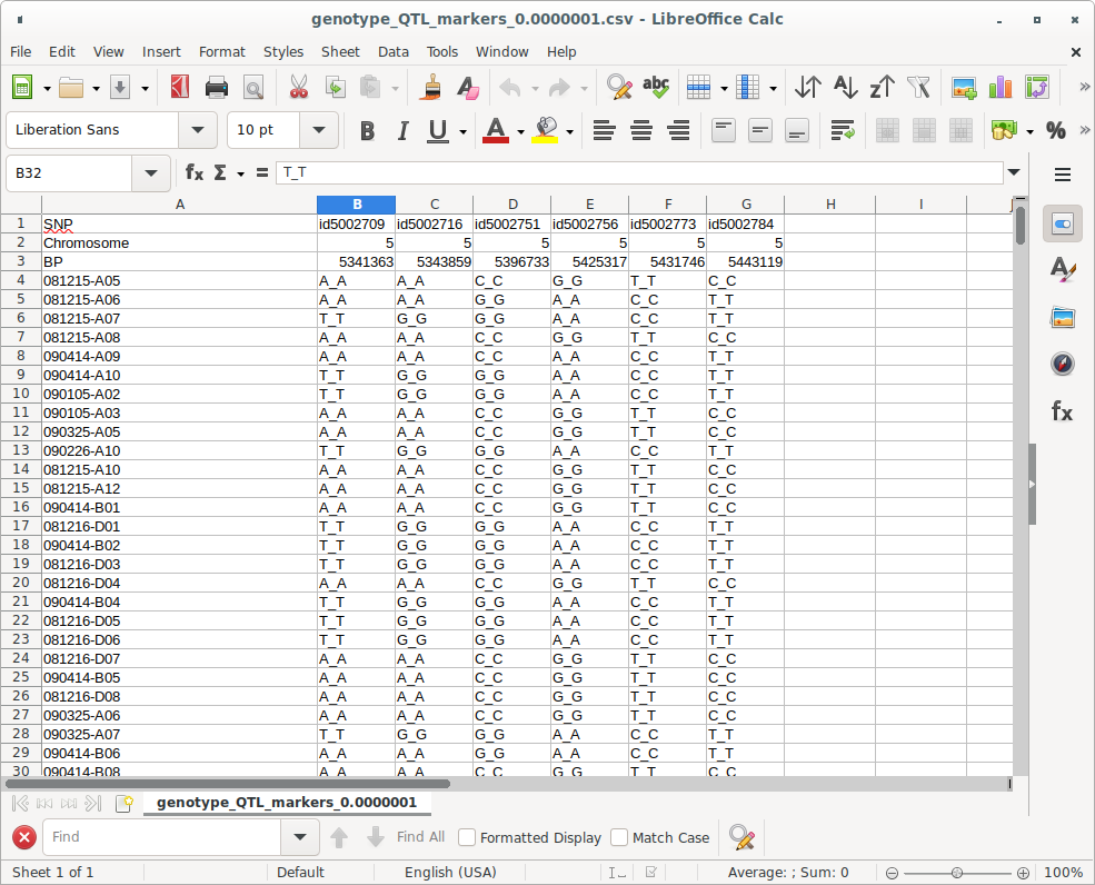
(Figure 4)
Figure5 shows the “Violin plot” tab page selected within the QTLmax Workbench. The “Violin plot” tab page has many setting options. If you don’t want to select each setting option individually, just click the [Load demo] button. You’ll see that most of the setting options are configured automatically (Figure 5). You can freely change the settings to your desired values.
Click the [Haplotype (CSV)] button and select a file containing SNP pairs for QTL markers. You’ll see the header list of that file displayed in the “SNP columns” list box. Click the [Phenotype (CSV)] button and select the phenotypic data file. You’ll see the header list of that file displayed in the “Phenotype columns” list box. (Figure 5)
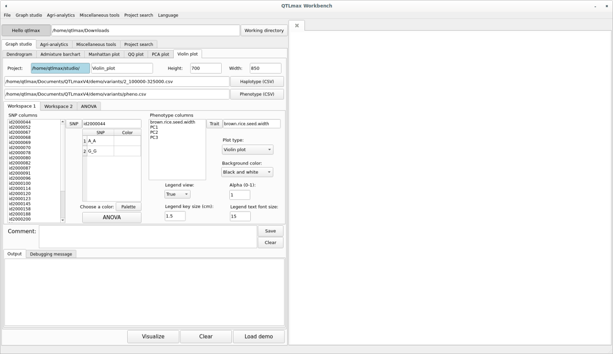
(Figure 5)
In the “SNP columns” list box, select an SNP marker and click the [SNP] button. That marker will be selected, and information about the alleles included in that marker will be listed. Select an allele and click the [Palette] button to display a window pop-up palette. From there, select your desired color, which will then be assigned to the chosen allele. Repeat this process to select colors for all alleles. (Figure 6)
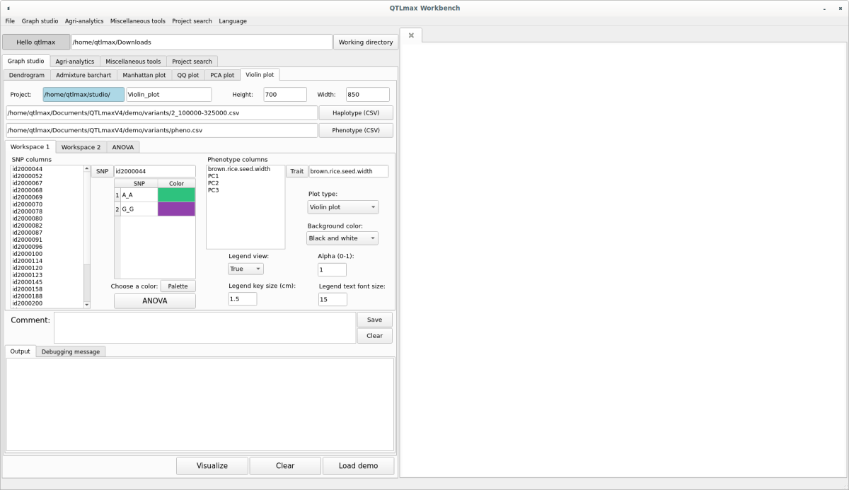
(Figure 6)
Go to the Workspace 2 tab page and select whether to display the Main title. If you check the display option, enter the Main title value. Once all settings are complete, click the [Visualize] button, and you’ll see the Violin plot appear on the right-hand drawing panel (Figure 7).
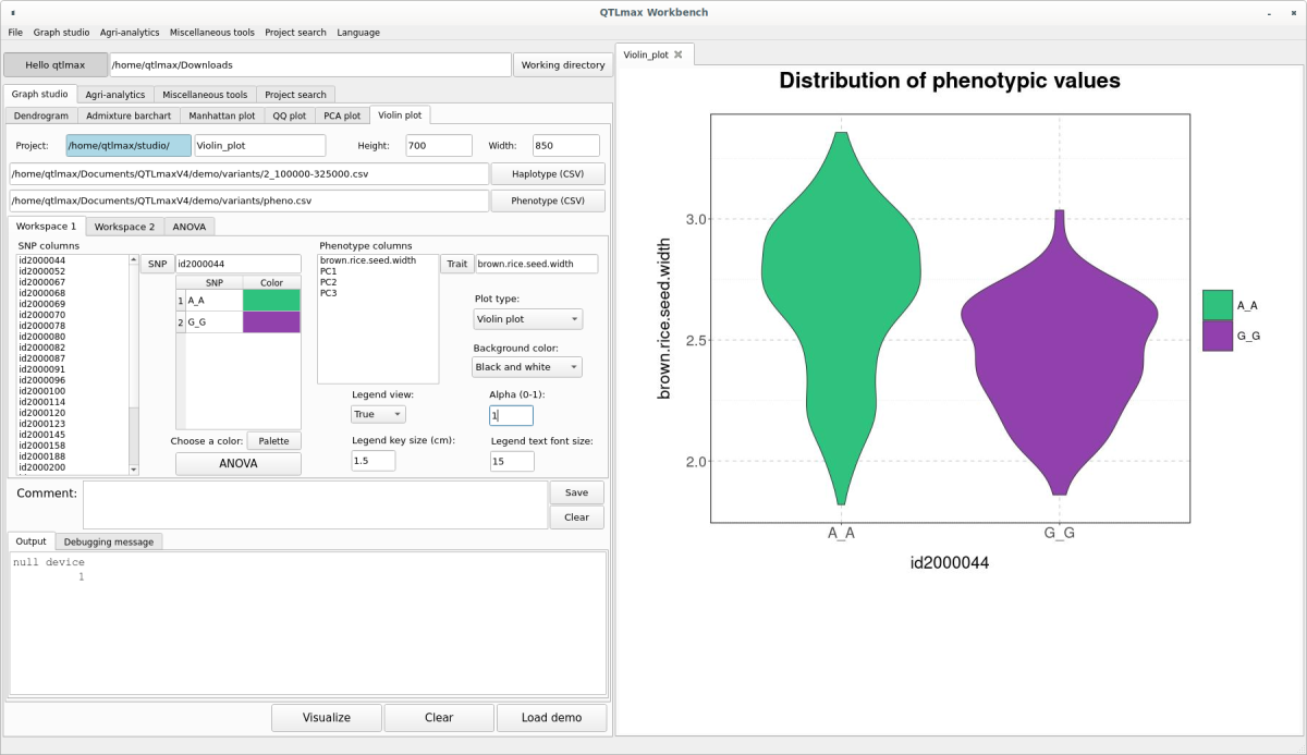
(Figure 7)
To view the ANOVA analysis results related to the displayed Violin plot, simply click the [ANOVA] button. (Figure 8)
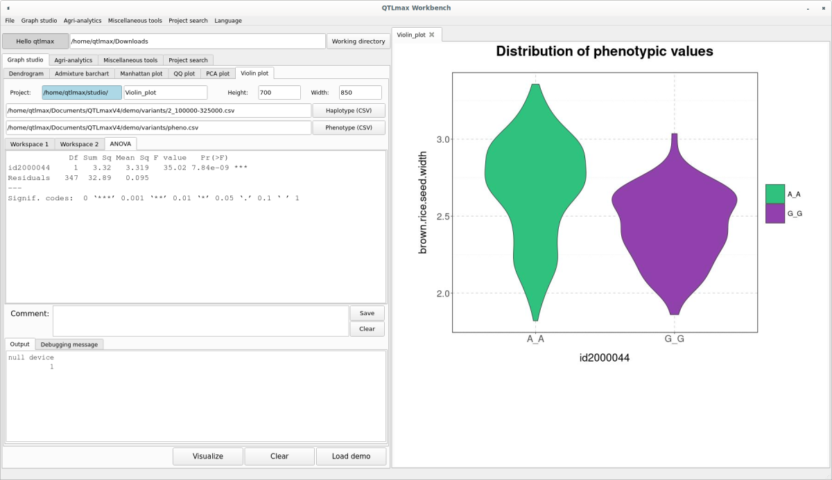
(Figure 8)
The transparency of the plot can be changed in the “Alpha (0-1)” field. The closer this value is to 0, the more transparent the plot will become.
The Violin plot drawn in (Figure 7) can also be changed to a Density plot or a Box plot by adjusting the “Plot type” combo box. The Density plot is shown in (Figure 9), and the Box plot is shown in (Figure 10).
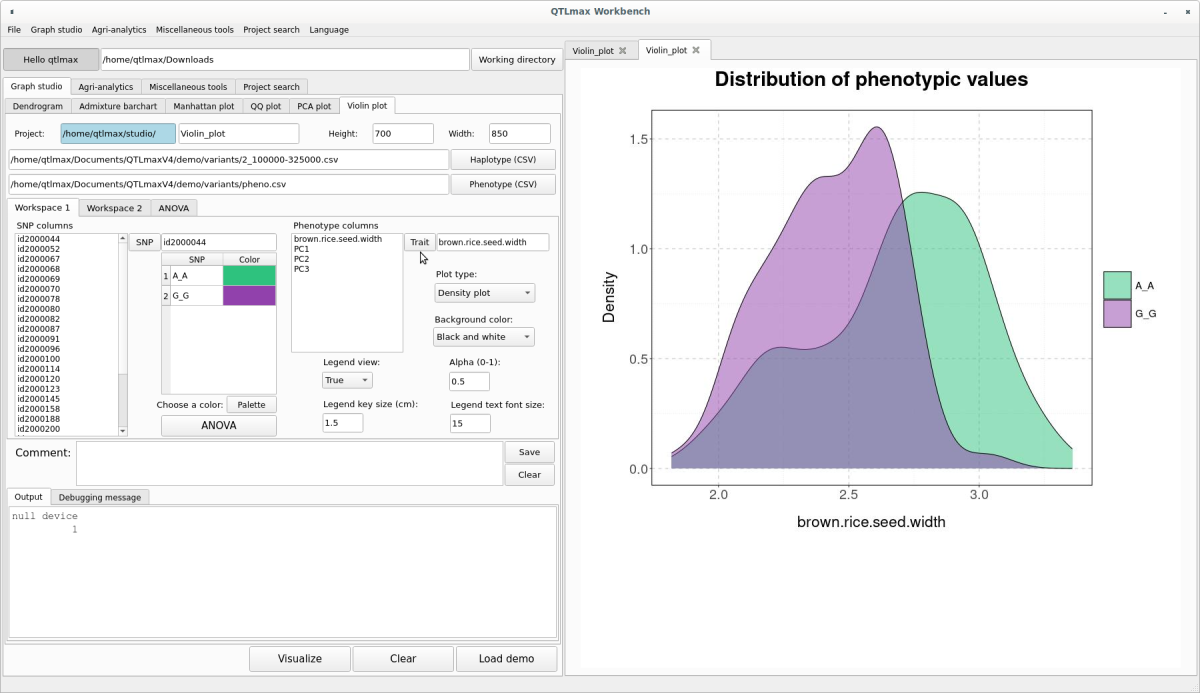
(Figure 9)
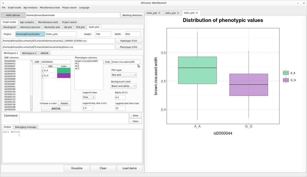
(Figure 10)