Figure 1 shows QTLmax Workbench with the “Scatter Plot Matrix” tab selected.
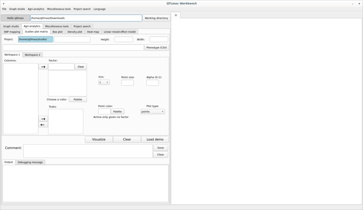
(Figure 1)
The “Scatter Plot Matrix” tab has many configuration options. If you don’t want to select each setting individually, simply click the [Load demo] button. You’ll see most of the settings are automatically configured (Figure 2). The input data format is a CSV (*.csv) file containing multiple phenotypic information. After replacing the demo data with your own, you can freely change the settings to your desired values.
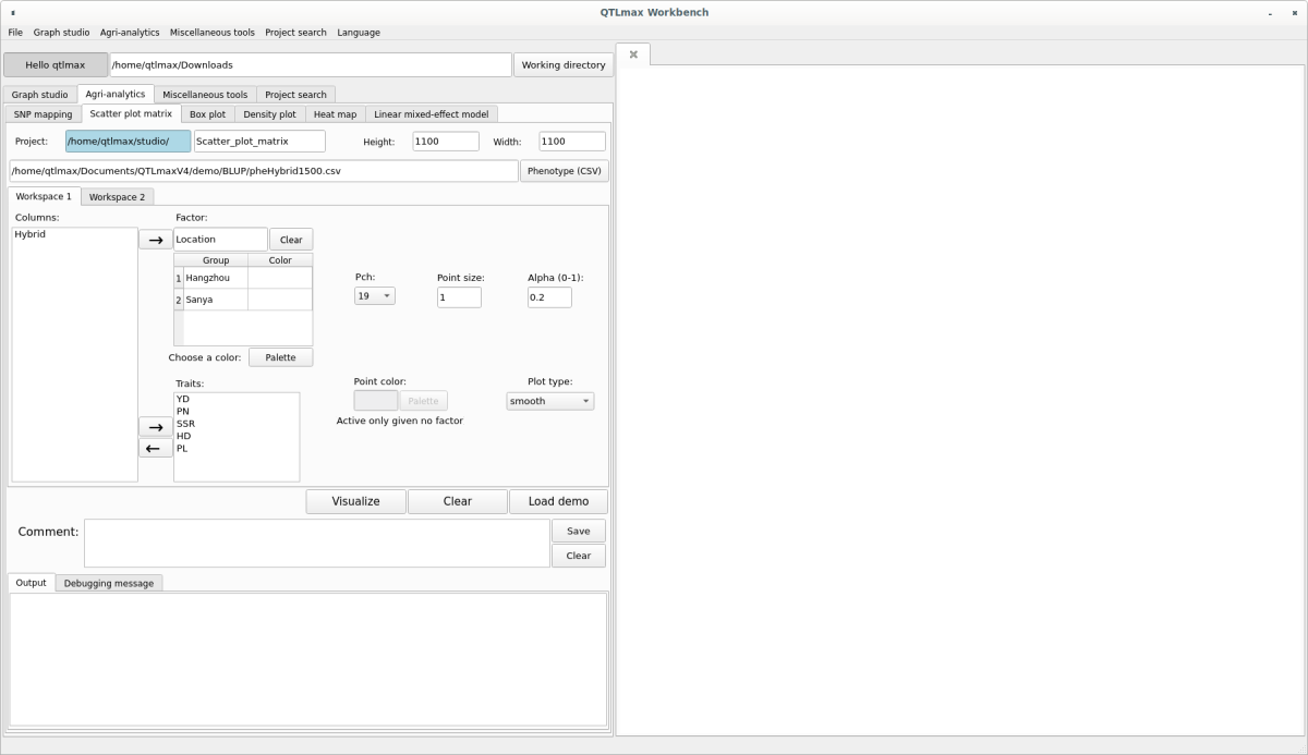
(Figure 2)
You will see the header values of the data you entered displayed in the Columns box. From here, select the trait you want to compare for correlation one by one. Then, click the [->] button to add the trait’s name to the Factor table. Once you’ve selected all traits, choose each trait within the Factor table and click the [Palette] button. From the pop-up palette, select your desired color. Repeat this process to select colors for all the chosen traits.
Navigate to the second tab named Workspace 2. Here, you can choose whether to display the Main title. If you check the box to display it, enter the desired Main title value. Once all your settings are complete, click the [Visualize] button and you’ll see the Scatter Plot Matrix appear in the plot area on the right (Figure 3).
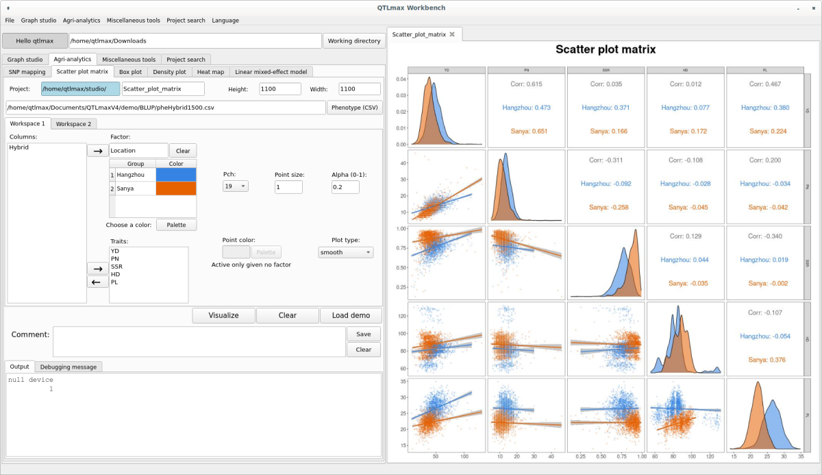
(Figure 3)