This post will explain how to draw a QQ plot using QTLmax Workbench. When you perform GWAS calculations in QTLmax, the following result files are generated:
- genotype.ped
- genotype.map
- pvalues
- pvalues_map.csv
To draw a QQ plot using QTLmax, you only need file #3: pvalues.
Figure 1 shows the QQ plot drawing tab selected within the QTLmax Workbench program. This tab presents several configuration options. If you prefer not to select each setting individually, simply click the [Load demo] button; most of the settings will then be configured automatically. (Figure 1)
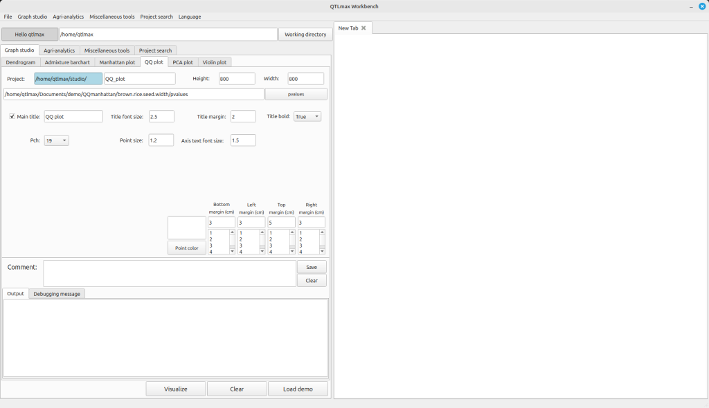
(Figure1)
After replacing the demo data with your own, you’re free to change the settings to your desired values. Selecting the color for the points to be displayed on the QQ plot is mandatory. Once all settings are finalized, click the [Visualize] button, and you’ll see the QQ plot generated (Figure 2).
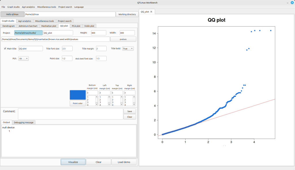
(Figure 2)