When you perform GWAS calculations in QTLmax, the following result files are generated:
- genotype.ped
- genotype.map
- pvalues
- pvalues_map.csv
To create a Manhattan plot using QTLmax, you’ll need two of these four files: genotype.map (file #2) and pvalues (file #3). This post will explain how to draw a Manhattan plot using QTLmax Workbench.
Figure 1 shows the Manhattan plot drawing tab selected in QTLmax Workbench. This tab has many settings options. If you don’t want to select each setting manually, just click the [Load demo] button. You’ll see that most of the settings are configured automatically. After replacing the demo data with your own, you’re free to change the settings to your desired values. Selecting colors for each chromosome is mandatory. Once all settings are finalized, click the [Visualize] button, and you’ll see the Manhattan plot generated (Figure 2).
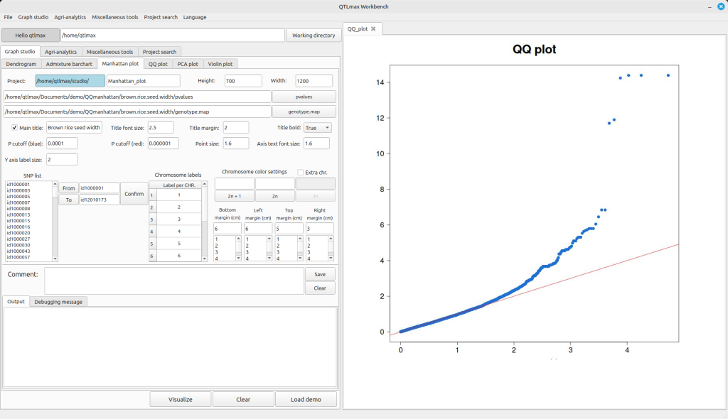
(Figure 1)
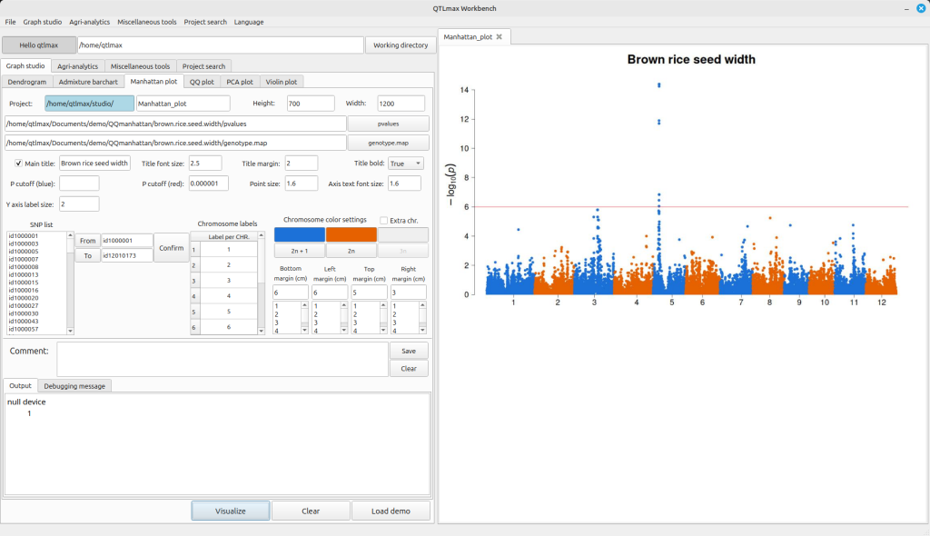
(Figure 2)
If the crop species used in your GWAS analysis is a hexaploid and you want to display the Manhattan plot with three colors, check the “Extra chr.” box. This will activate the “3n” button. Clicking this button will bring up a palette window where you can select your desired color to specify the third color. Additionally, you can change the labels for each chromosome by editing the values in the Chromosome labels table (Figure 3).
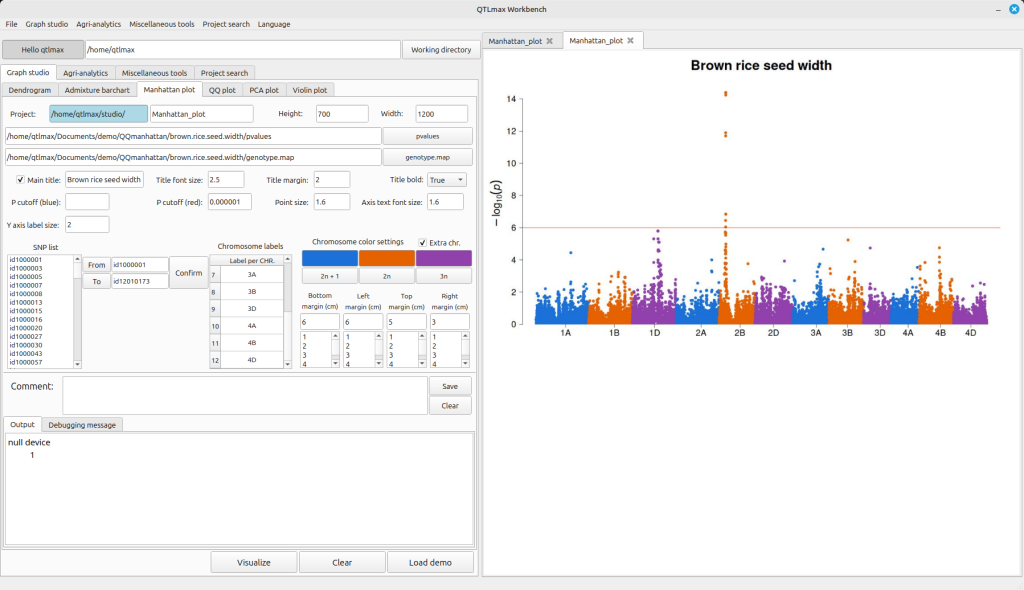
(Figure 3)
If you want to draw a Manhattan plot for only a specific genomic region, you can do so by selecting the desired start and end points. First, choose the SNP you want to use as the starting point in the SNP list box and click the [From] button. Then, select the SNP for the end point and click the [To] button.
After this, click the [Confirm] button, and you’ll see the “Chromosome labels” update. Finally, click the [Visualize] button to generate the Manhattan plot exclusively for the genome window you’ve defined (Figure 4).
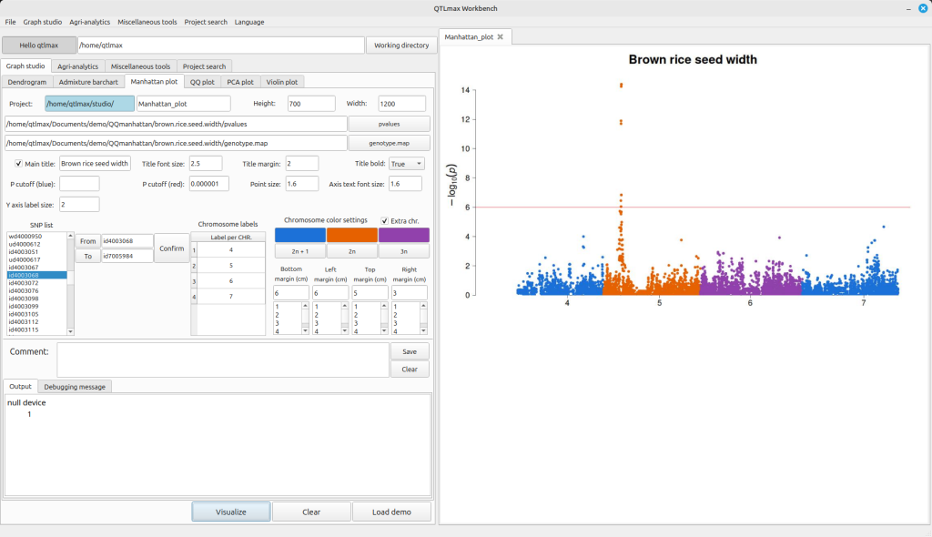
(Figure 4)