Figure 1 shows the Admixture tab page selected. On this tab page, you can choose the K values. The K value ensures that the entire population will be classified into K groups. If you want to iterate calculating the Admixture analyses from one K value to another greater one, please ensure that the given check box is checked, and select two K values.
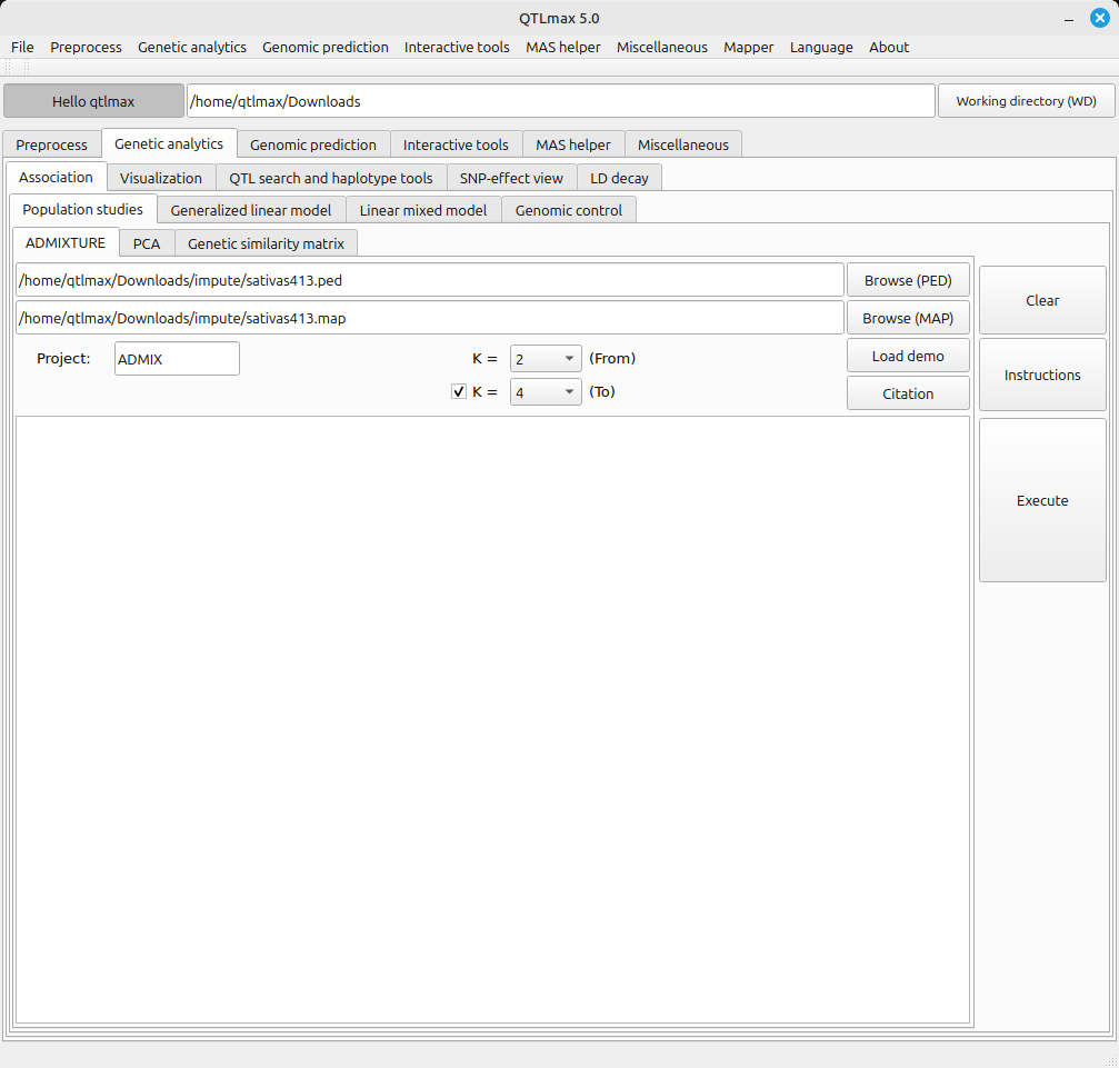
(Figure 1)
Figure 2 shows the admixture analysis completed. You can see the relevant messages displayed.
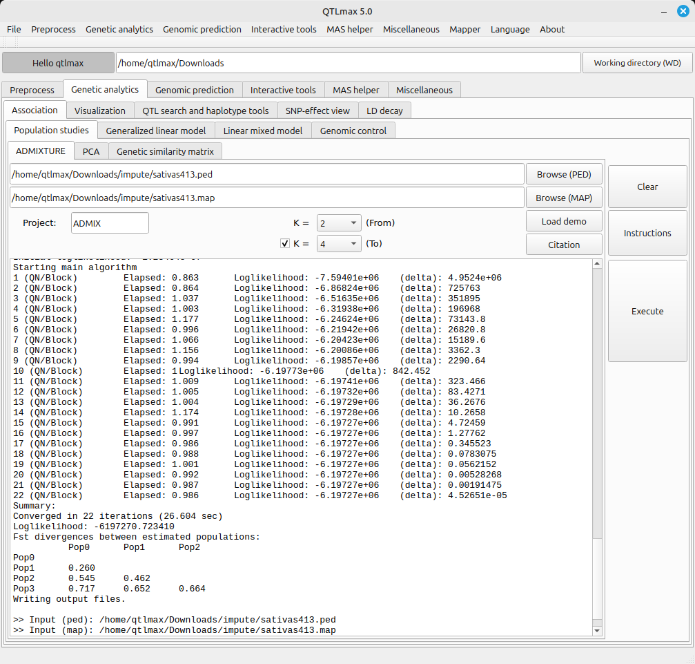
(Figure 2)
Figure 3 shows the Admixture Bar Chart tab page selected within QTLmax Workbench. This tab page offers many configuration options. If you don’t want to manually select each setting, simply click the [Load demo] button. You’ll see that most of the settings are configured automatically.
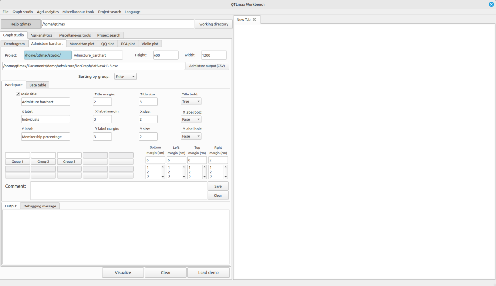
(Figure 3)
After replacing the demo data with your own, you’re free to change the settings to your desired values. You’ll also need to assign colors for each group. Once all your settings are complete, click the [Visualizer] button. You’ll then see the admixture plot generated. The “Sorting by group” combo box has two options:
(1) not sorted
(2) sorted
Figure 4-1 shows the admixture plot when it’s not sorted, while Figure 4-2 displays the admixture plot in a sorted arrangement.
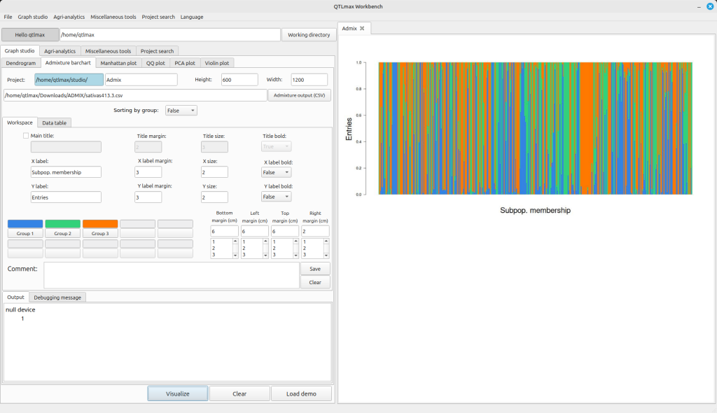
(Figure 4-1)
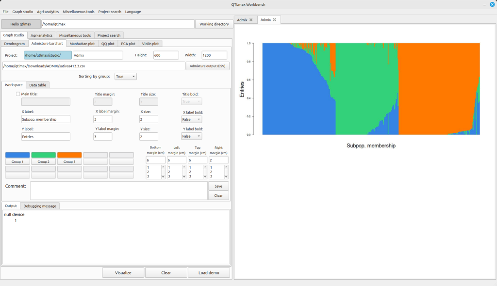
(Figure 4-2)
On the “Data table” tab page, you can view the data corresponding to the admixture plot displayed in the figure. (See Picture 5)
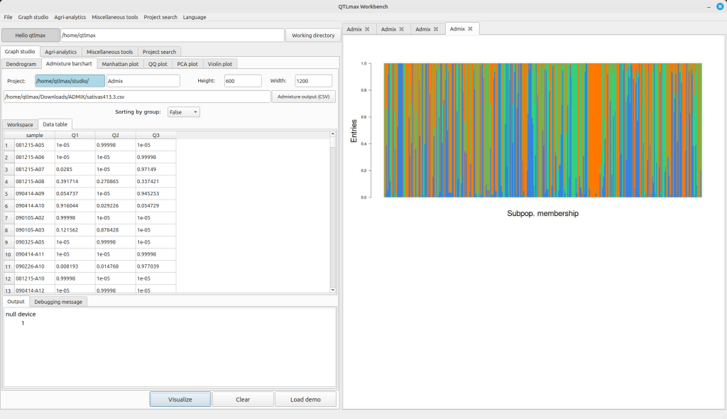
(Figure 5)