This post explains how to visualize a physical map of SNPs. Simply put, this physical map is a graphical representation, so called an ideogram. However, QTLmax offers functionality far beyond other ideogram tools:
- Interactive Markers: Marker names are clickable and link directly to the designated genomic region in a genome browser.
- Integrated Layout: Physical chromosome maps can be aligned with corresponding Manhattan plots in the top and bottom spaces. This provides a more intuitive comparison between a marker’s physical position and its QTL signal.
- Advanced Customization: The design of the physical map can be finely tuned through a wide range of flexible editing options.
The tool for these graphics is called Qmapper, which was first introduced with the launch of QTLmax 5.0.
From now on, let’s get started with how to construct a physical map of SNPs using QTLmax 6.0. For your brief overview, Figure 1 is a resulting output as an example; we are going to make the exact output in this tutorial.
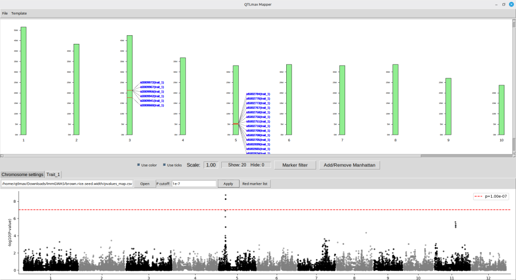
(Figure 1)
“Qmapper is a dedicated application. You can launch it by clicking the [Qmapper] button (highlighted with a red square) located at the bottom-right of the ‘Genome browse’ tab, or by selecting the ‘Qmapper’ item under the Mapper menu at the top (Figure 2).”
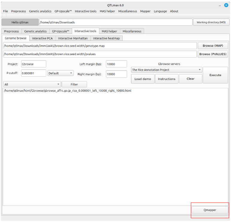
(Figure 2)
Shown in Figure 3 is the appearance of Qmapper. In order to display a layout of chromosomes for template of SNPs, you must load a chromosome-template file which is in a text format.
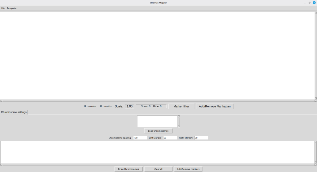
(Figure 3)
The text file for chromosome template can be found in the following path:
~/Documents/QTLmax/demo/mapper/rice_genome.txt
Figure 4 showcases its contents, which include each chromosome number and its total length. In each record, the two values can be separated by either spaces or tabs. Clicking the [Load Chromosomes] button opens a file browser, allowing you to select the template file. In this tutorial, the above file was selected from at the designated path.
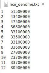
(Figure 4)
Figure 5 shows the Qmapper interface after the chromosome template has been drawn. You can see a list of records is shown in the central panel.
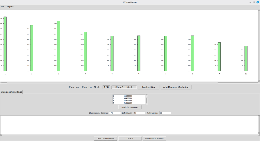
(Figure 5)
Next, let us add SNP markers to be positioned on the template. Pressing the [Add/Remove markers] button will pop up a new form as shown in Figure 6.
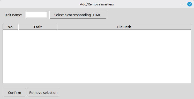
(Figure 6)
Make sure to enter a trait name in association with the SNPs to visualize. After that, pressing the [Select a corresponding HTML] button opens a file browser, allowing you to select an HTML file; please note that the HTML file must be an output generated by ‘Genome browse’ feature in QTLmax 6.0. (See Figure 7)
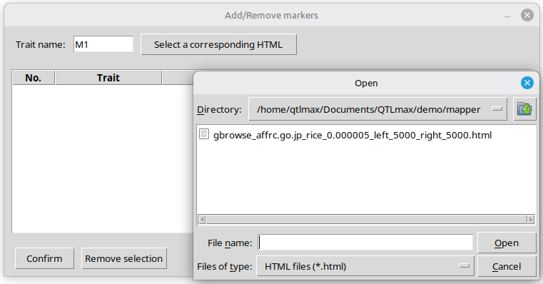
(Figure 7)
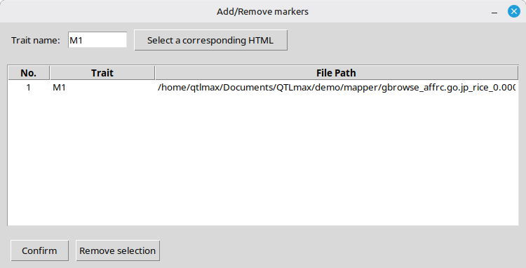
Figure 8 showcases the interface of the popup window after confirming the selection of an HTML file you desire.
(Figure 8)
Pressing the [Confirm] button will lead to the interface shown in Figure 9. The bottom panel is filled with new information related to the SNPs fed from the input dataset.
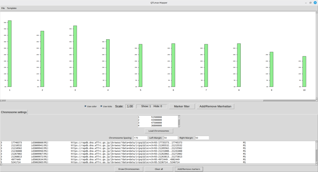
(Figure 9)
Pressing the [Draw Chromosomes] button will make the SNPs appear on the top panel as shown in Figure 10. It is important to note that each marker name is clickable, linking directly to a genomic window encompassing the respective SNP. Each window range is pre-defined by the ‘Genome browse’ feature in QTLmax 6.0. (For more details, visit here: https://open.qtlmax.com/guide/index.php/2026/02/09/genome-browse/)
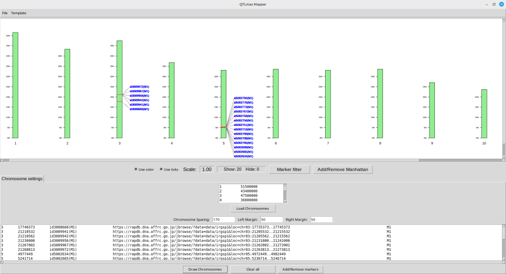
(Figure 10)
Clicking each SNP name will open up a new web browser, leading to its genome browse window. (Figure 11)
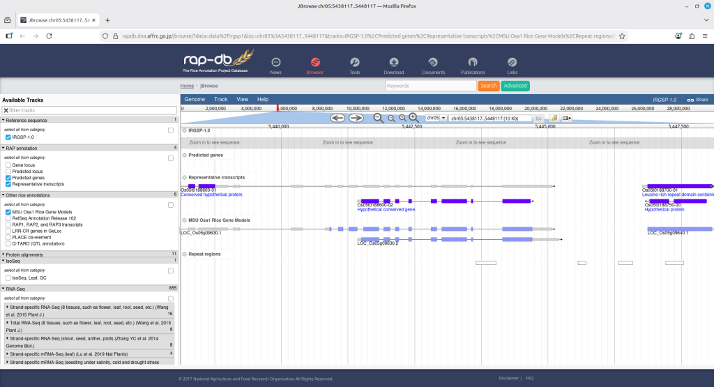
(Figure 11)
Sometimes you may want to hide some SNPs from the visualized map. If it is the case, pressing the [Marker filter] button will pop up a new form as shown; therein, you can send SNP names to hide to the panel on the right hand side. (Figure 12)
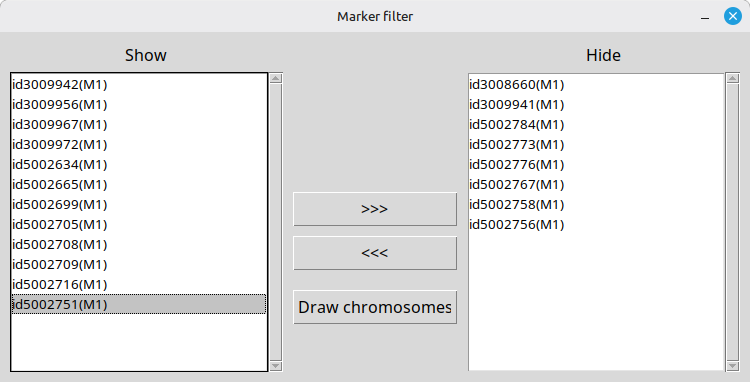
(Figure 12)
Pressing the [Draw chromosomes] button will lead to updating the physical map in the map display panel as shown in Figure 13.
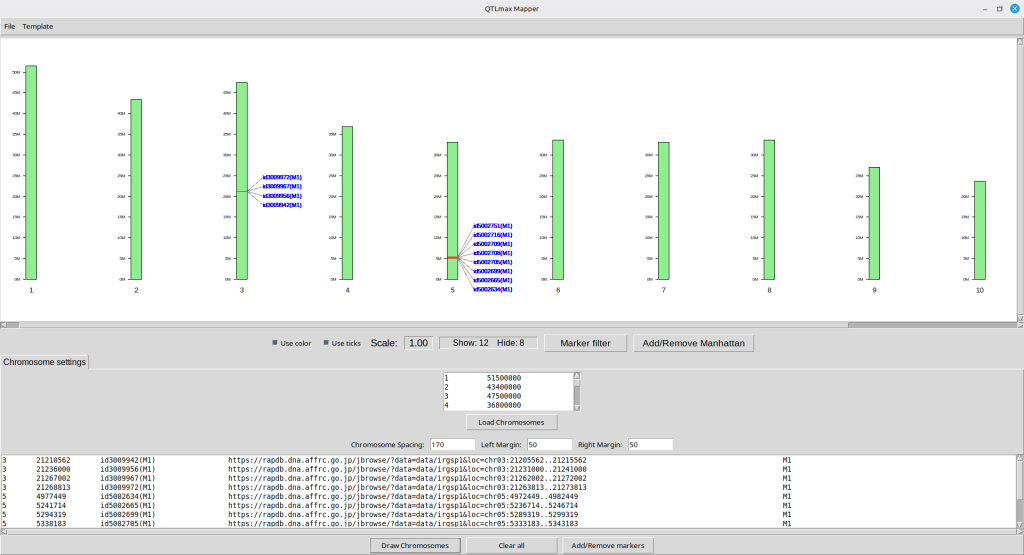
(Figure 13)
If you want to adjust the figure’s appearance, select ‘Template Panel’ from the ‘Template’ menu on the top bar. A new window will appear featuring nine horizontal sliders and two check boxes (Figure 14).
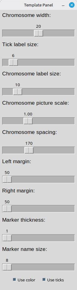
(Figure 14)
To change the chromosome color, select ‘Chromosome color’ from the ‘Template’ menu on the top bar. A color palette window will then appear (Figure 15).
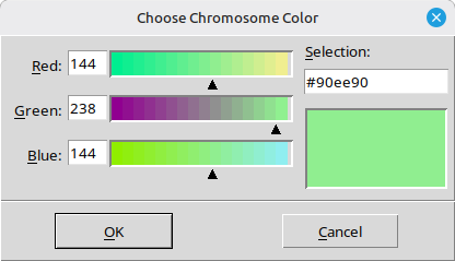
(Figure 15)
Figure 16 displays the updated physical map with the new graphical settings applied.
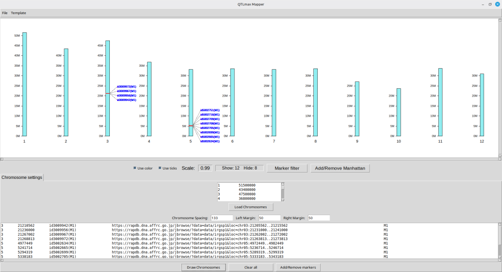
(Figure 16)
So far, we have represented a list of SNPs in the chromosome panel. From now on, this tutorial will show how to create a Manhattan plot, so that the same SNPs will be outstanding in a different graphical way. To do this, you must load the ‘pvalues_map.csv’ file by pressing the ‘Add/Remove Manhattan’ button. Pressing the button will pop up a new window for loading ‘pvalues_map.csv’ as an input file (Figure 17); it is important to note that the input file is automatically created as a result of GWAS procedure in QTLmax 6.0.
In this example, since the visualized SNPs were named ‘M1’ as their associated trait name (Figure 7), it is logical to enter the same name in the ‘Trait name‘ box. Next, clicking the [Select a corresponding CSV] button will open a file browser, allowing you to select the ‘pvalue_map.csv’ file of interest. (Figure 17)
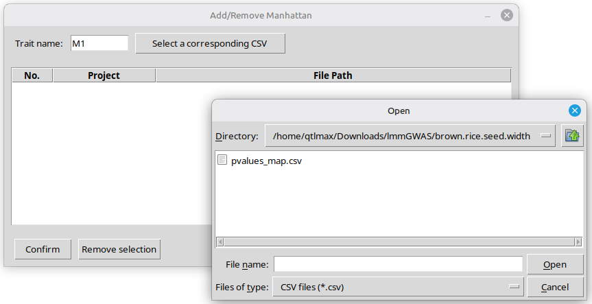
(Figure 17)
Figure 18 shows the interface after the input file has been chosen.
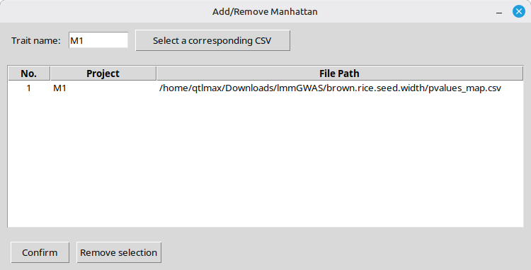
(Figure 18)
Clicking the [Confirm] button will display the interface shown in Figure 19, where the new Manhattan plot is visible under the newly created ‘M1’ tab. (Figure 19)

(Figure 19)
You can add a P-value threshold line by entering a desired threshold number, followed by pressing the [Apply] button. (Figure 20)
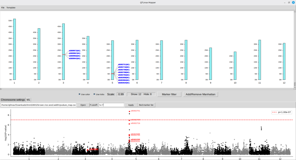
(Figure 20)
If you want to see information about each SNP in detail, press the [Red marker list] button; then a new pop-up window will show a list of SNP information as shown in Figure 21.
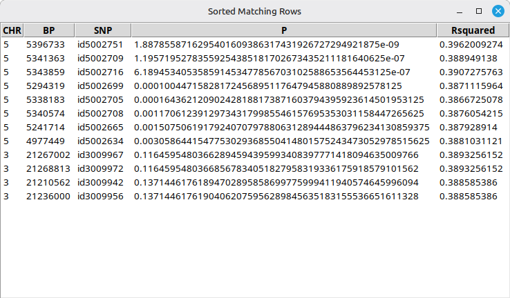
(Figure 21)
Essentially, a Manhattan plot figure resulting from a GWAS procedure can be exported to an image file by using QTLmax Workbench in a sophisticated manner.
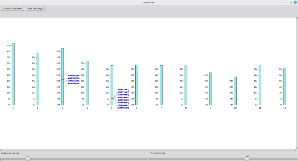
Similarly, the resulting SNP physical map can also be exported to an image file. To this end, select ‘Map viewer’ from the ‘Template’ menu on the top bar; a new image window will appear displaying the image as shown in Figure 22. Note that the SNP labels in this window is not clickable.
You can adjust the image position within the panel using two sliders at the bottom, labeled ‘Horizontal margin’ and ‘Vertical margin.’ Once the image is positioned as desired, pressing the [Save the image button] will create the resulting image file at the designated path in green text on top of the image panel. (Figure 22)
(Figure 22)