This post explains:
(1) how to calculate the correlation (r2) for all pairs of SNPs within a certain distance (e.g., 100 kb or 1 Mb).
(2) how to draw a linkage disequilibrium decay plot with a clean smooth curve line.
Figure 1 provides an overview of the genomic dataset loaded for analysis. It presents that the number (26677) of SNPs is automatically populated in the field labeled “MAP size”.
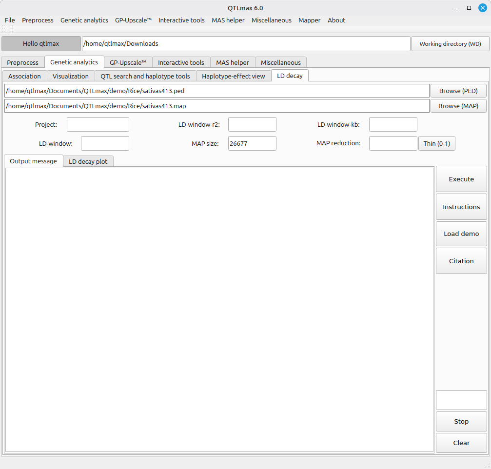
(Figure 1)
The primary goal of this computation is to calculate the correlation (r2) for all SNP pairs within a defined distance. Because the computational cost increases exponentially as the number of SNPs grows, using every single pairwise comparison is often impractical. Instead, it is typically sufficient to calculate correlations among a subset of SNPs randomly sampled within specific distance windows.
To perform random SNP sampling, enter a proportional value (between 0 and 1) in the field labeled ‘MAP reduction’ and click the [Thin] button. The original input files (.ped and .map) will then be automatically replaced by a new pair of files containing the reduced number of SNPs as specified (Figure 2).
Consequently, the remaining configurations, inherently required by PLINK software, need to be set. The meaning of each configuration is as follows:
(1) LD-window-kb: Defines the maximum physical distance (in kb) between a pair of SNPs for the LD calculation.
(2) LD-window: Sets the maximum number of SNPs allowed between a pair of loci. If this threshold is exceeded, the pair is ignored even if it falls within the distance limit.
(3) LD-window-r2: Sets the minimum r2 threshold for reporting. For a complete LD decay plot, this is typically set to 0 to ensure all correlations—even weak ones—are included in the curve.
Figure 2 illustrates that all fields are filled, and that its computation has been completed. Accordingly, its analytical summary is displayed.
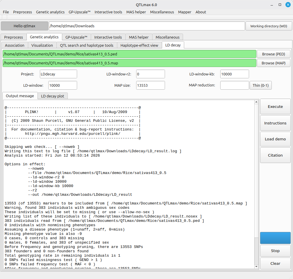
(Figure 2)
Next, let’s draw an LD decay plot based on the computed result; once the computation is finished, the output file is automatically loaded in the “LD decay plot” tab as shown in Figure 3.
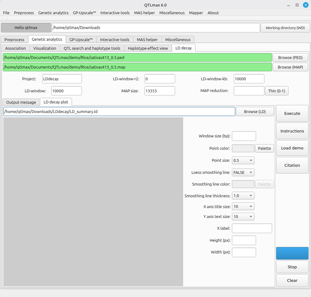
(Figure 3)
Figure 3 shows a panel of configurations. Instead of addressing each field or option one after another, you can simply let it all configured by pressing the [Load demo] button; then all fields and options will be automatically filled as programmed. Then, pressing the [Execution] button will generate the LD decay plot as shown in Figure 4. If you want to redesign the figure, you can adjust the settings as desired.
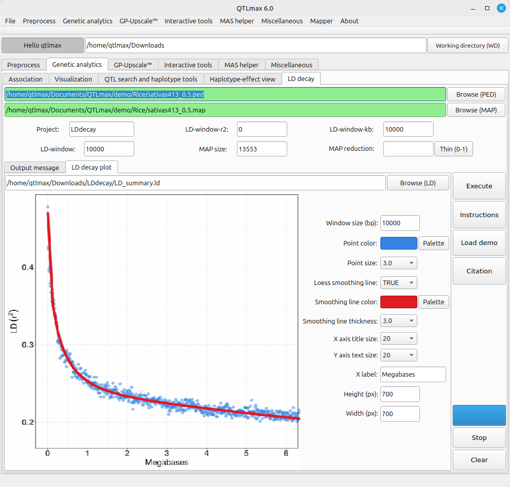
(Figure 4)